Brand Identity for a financial solutions company
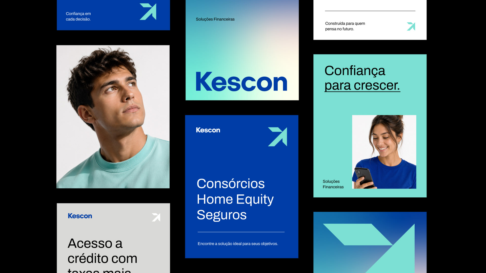
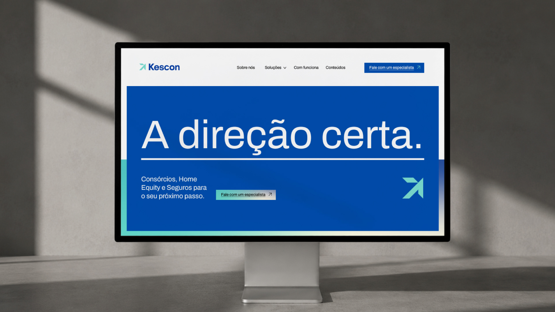
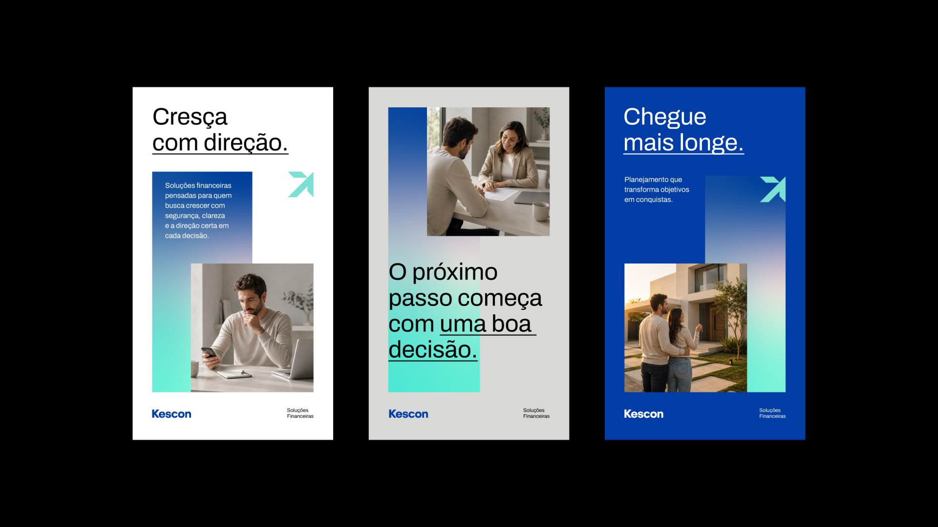
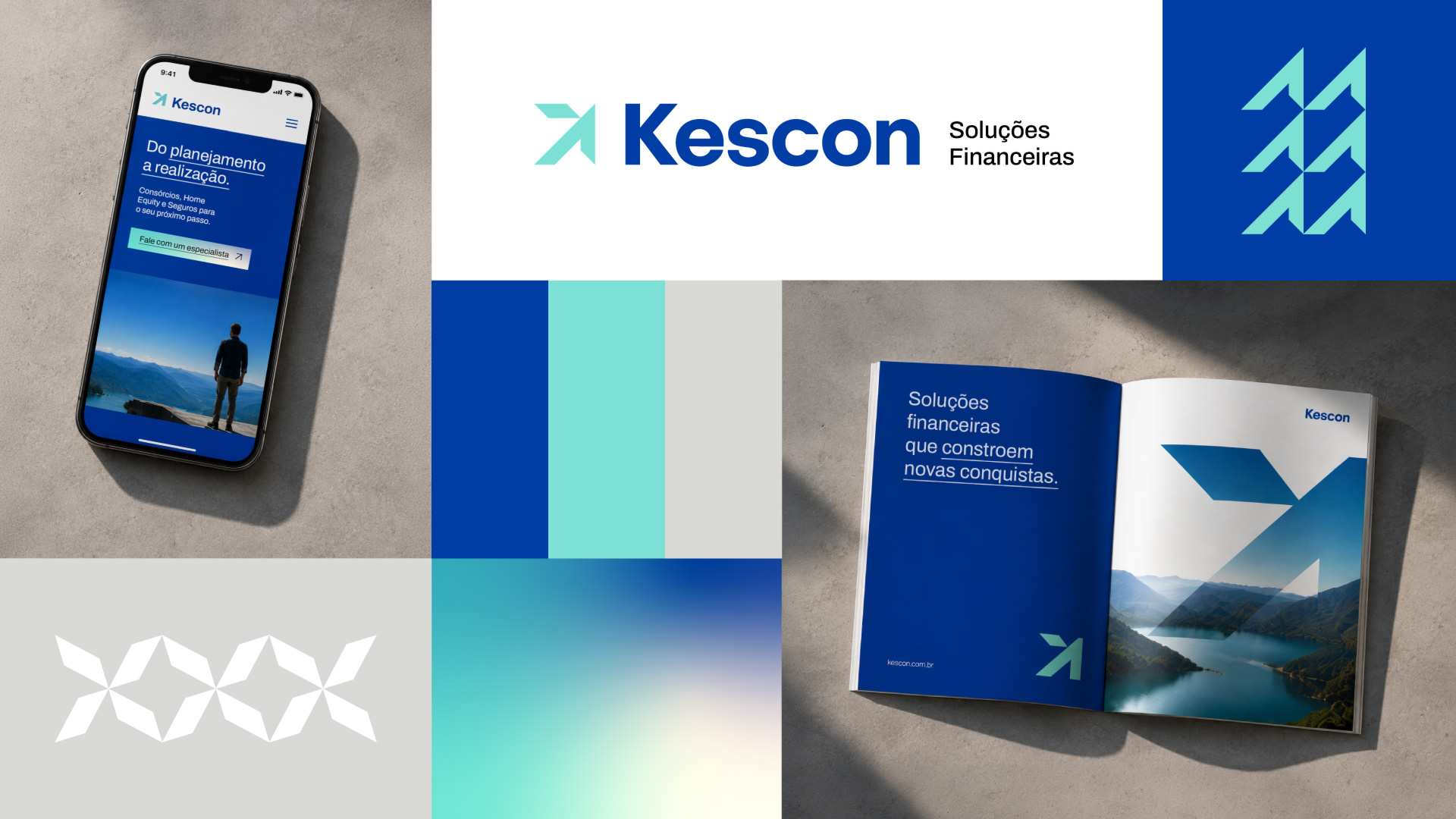
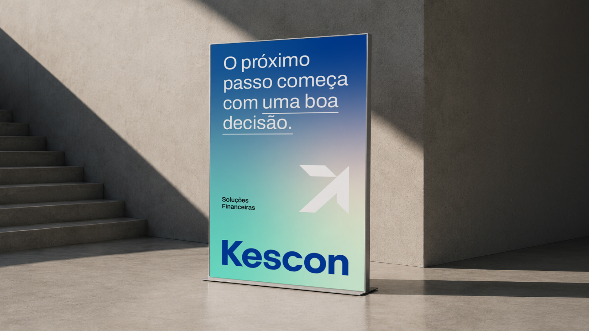
Kescon helps people get there through consortiums and Home Equity credit. The brand needed to look serious and grounded, the kind of company you'd trust with a house or a car, but without feeling stiff like most finance brands do.
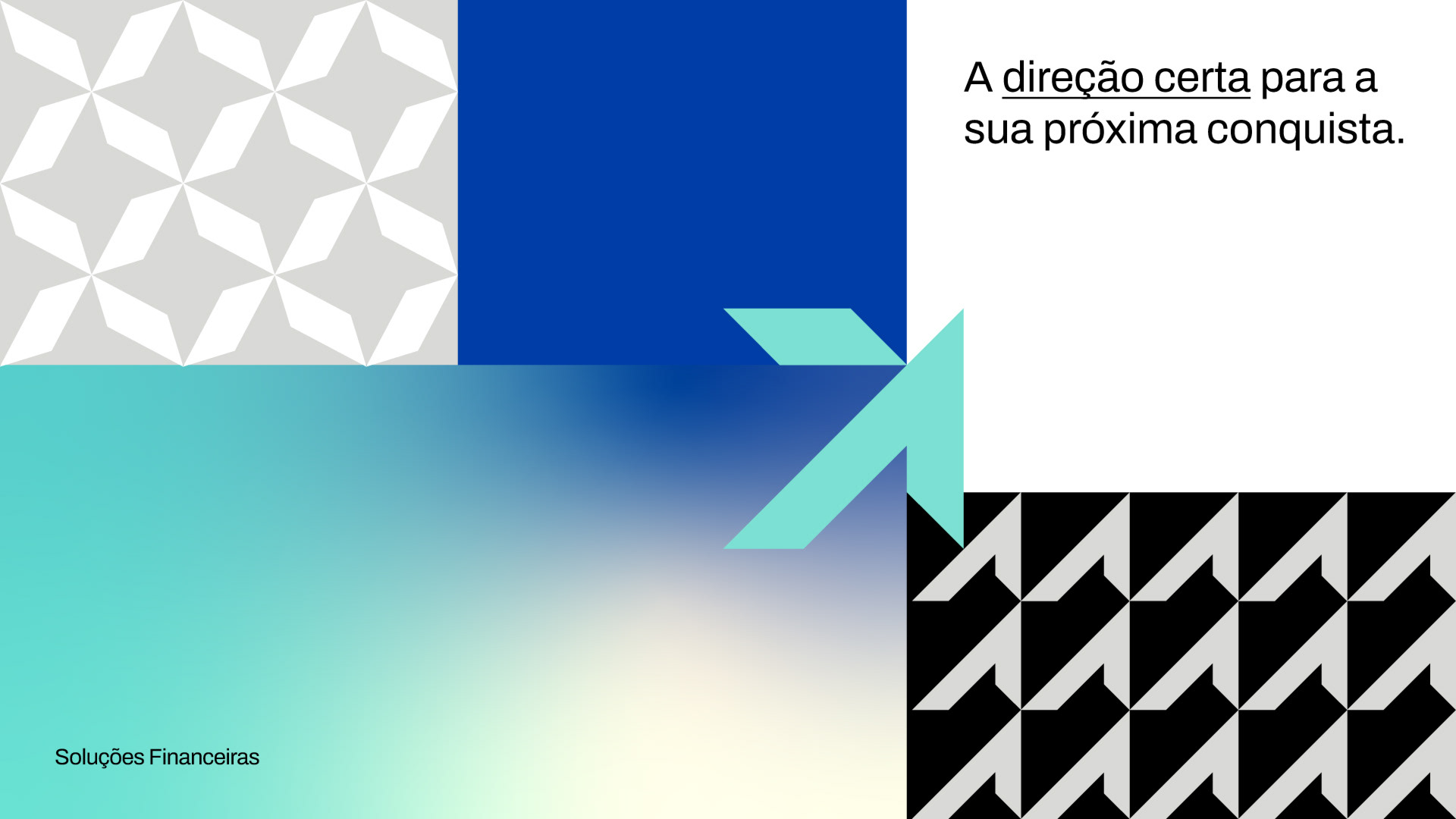
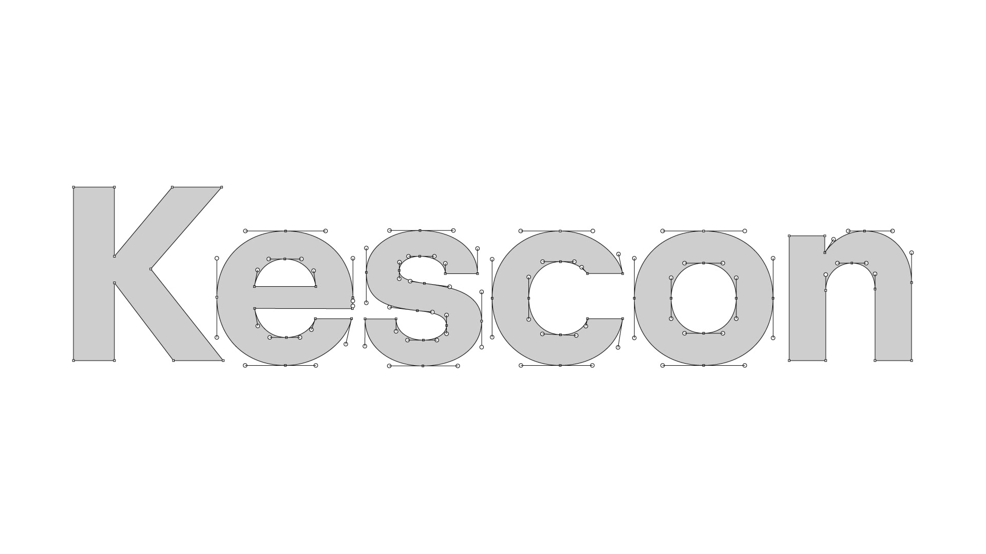
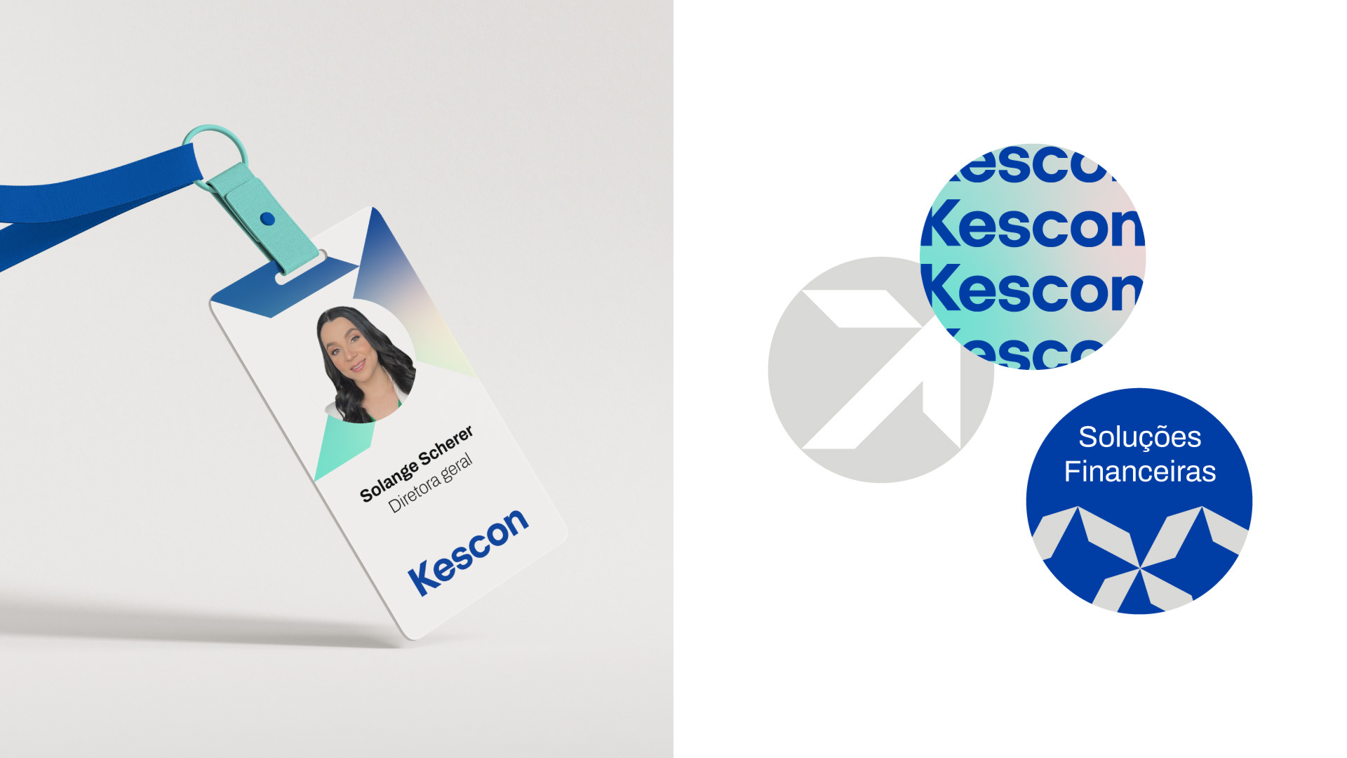
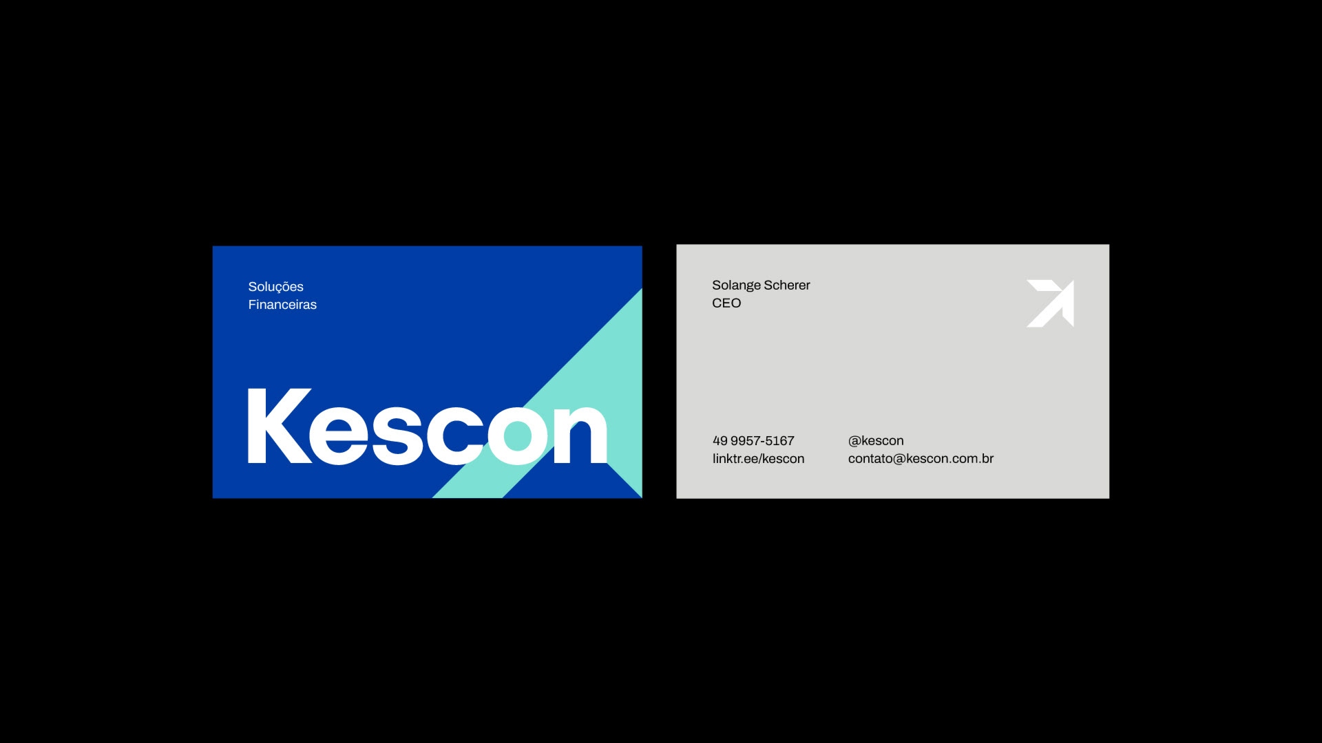
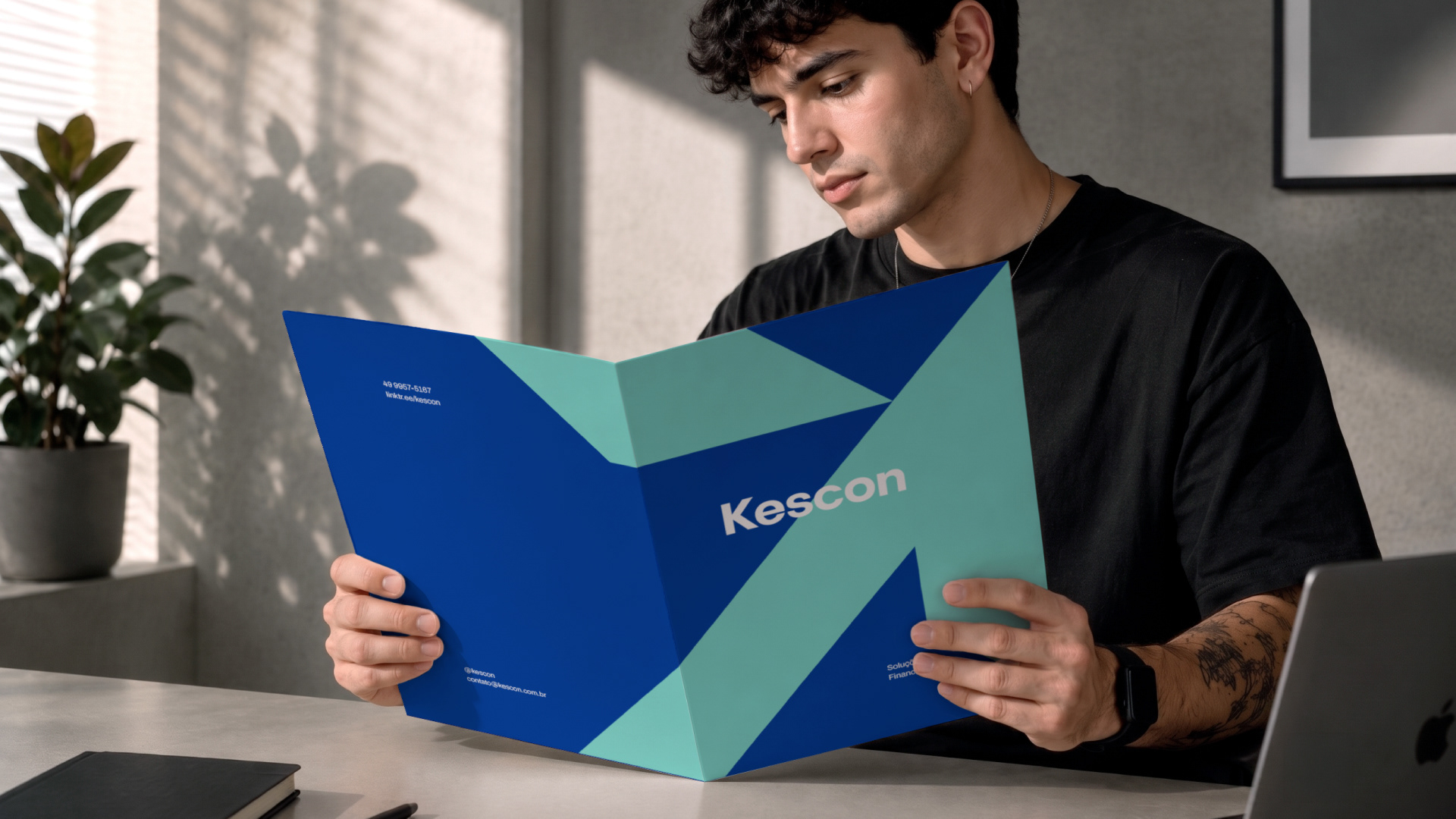
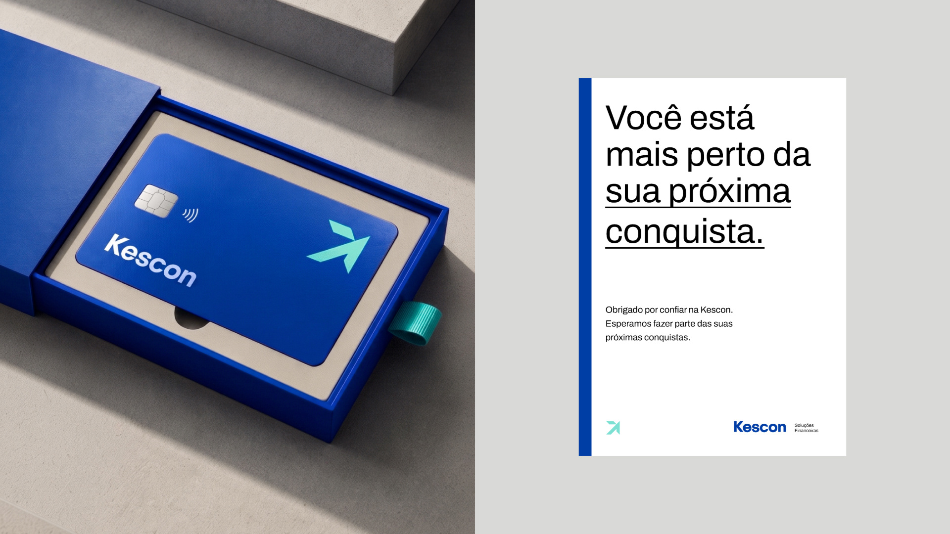
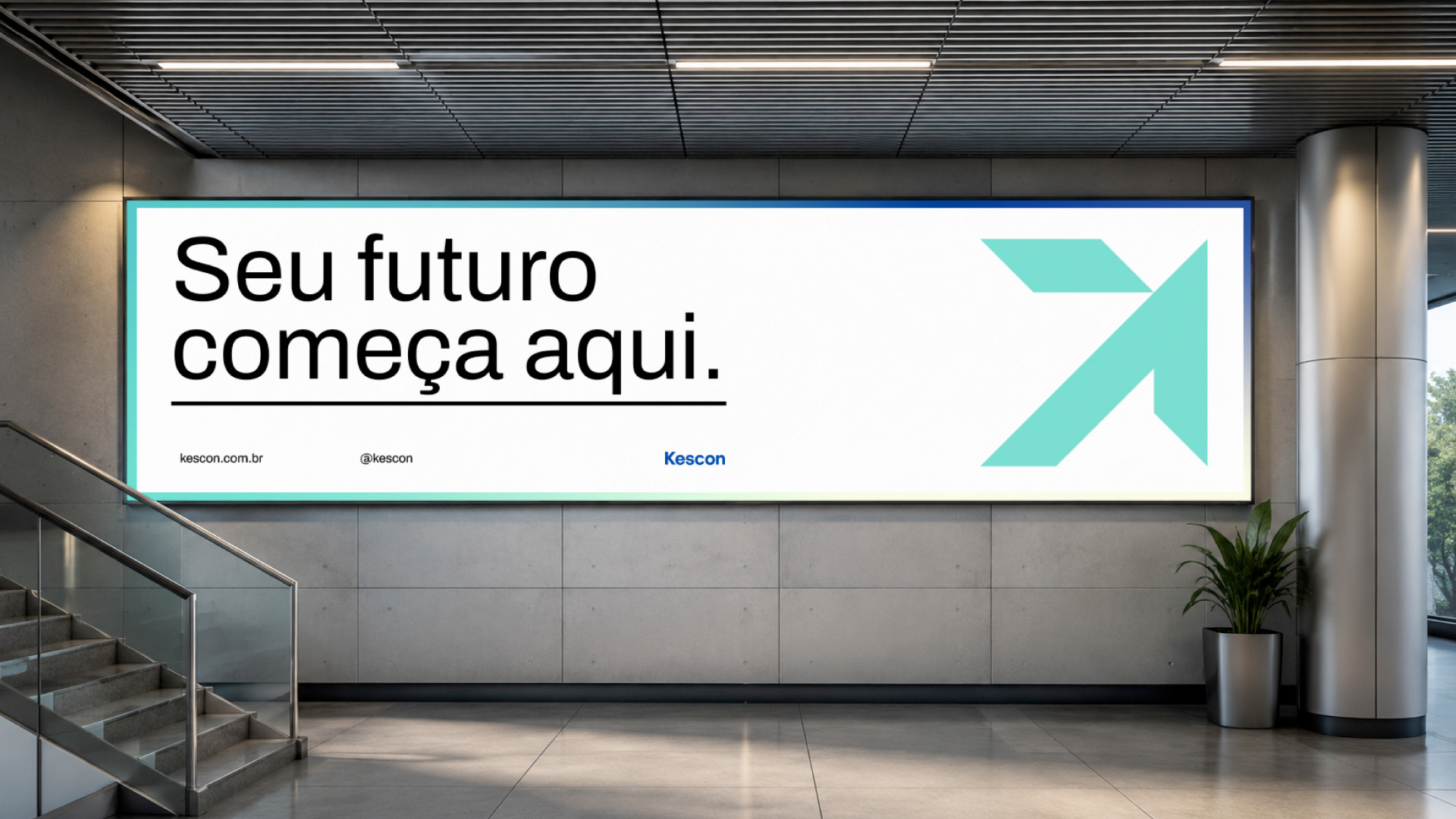
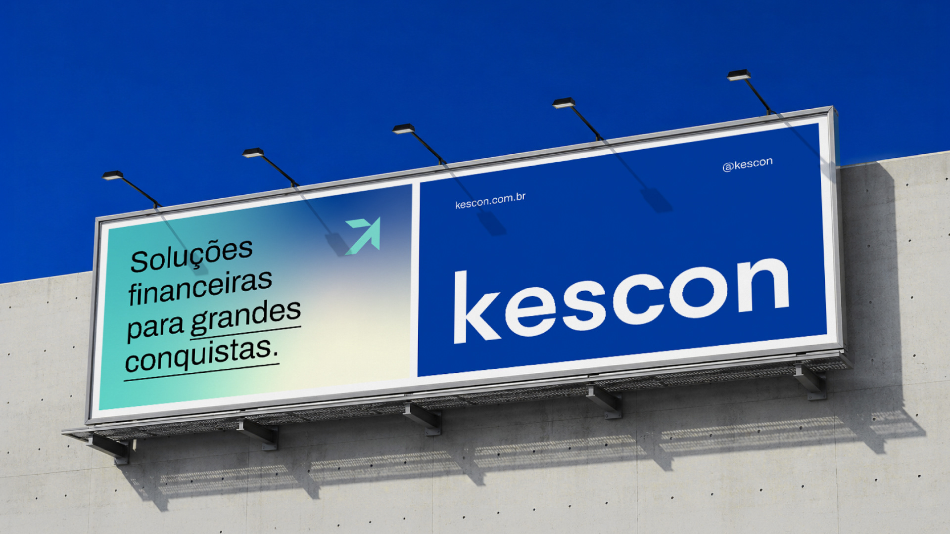
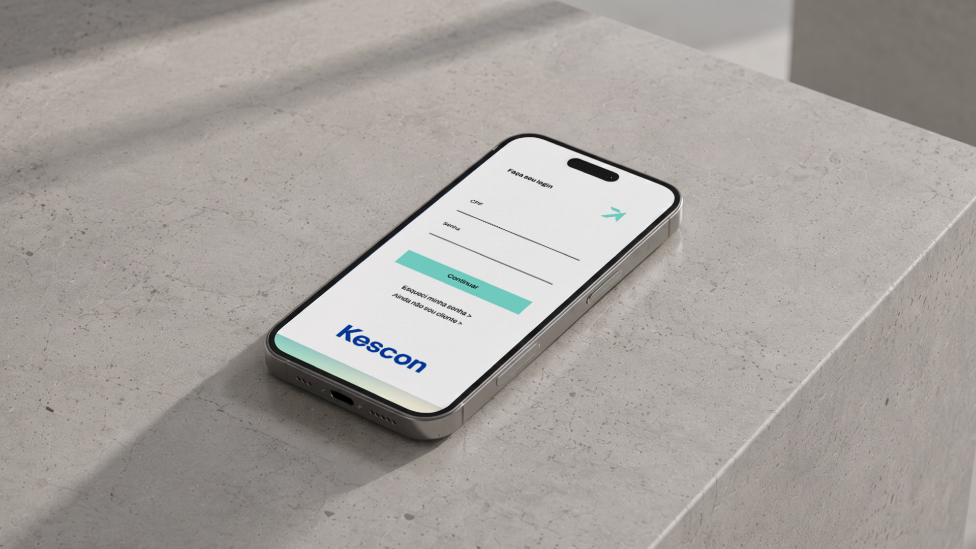
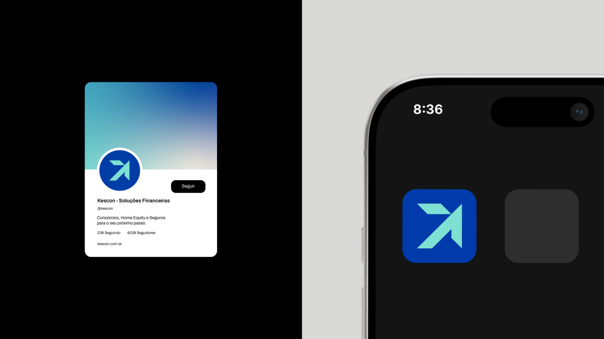
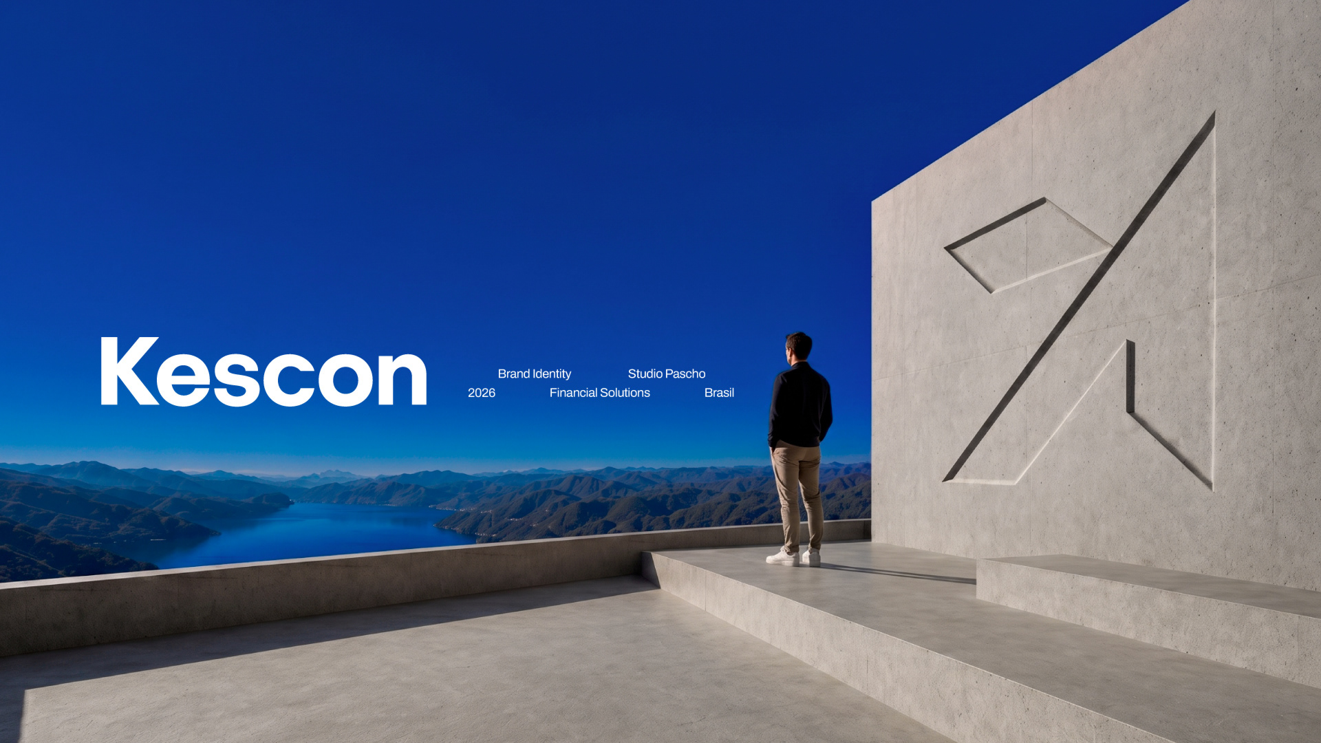
The symbol comes from the letter "K", reshaped into an arrow pointing up. One side for each founder, both aimed at the same point.
Identidade visual para a Kescon, empresa de consórcios e Home Equity de Chapecó/SC. O símbolo nasce do "K" da marca, transformado em seta: direção e confiança em um só traço.
Identidade visual para a Kescon, empresa de consórcios e Home Equity de Chapecó/SC. O símbolo nasce do "K" da marca, transformado em seta: direção e confiança em um só traço.